

A practical guide to understanding particle size distribution, shape and WipFrag analysis results
Table of contents
- 1. Start With the WipFrag Chart
- 2. Read the Particle Size Distribution Curve
- 3. Understand D-Values
- 4. Understand the WipFrag Statistics
- 5. Read the Histogram and Size Classes
- 6. Use the Specification Envelope
- 7. Review Particle Size Visually
- 8. Interpret Particle Shape and Colour Results
- 9. Combine and Compare Results
- 10. Calibration, Fines and Measurement Limits
- 11. Turn WipFrag Results Into Decisions
- 12. Spatial Results for UAV Analysis
- 13. Export and Record Results
- WipFrag Results Quick Reference
1. Start With the WipFrag Chart
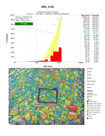
Once an analysis is complete, WipFrag converts the measured particles into a set of results describing the particle size distribution (PSD) and other characteristics of the analyzed material.
The standard WipFrag chart can include:
- a cumulative particle size distribution curve;
- a histogram;
- selected result statistics;
- user-defined size classes;
- a specification envelope;
- sphericity information; and
- colour results when Colour ID has been configured.
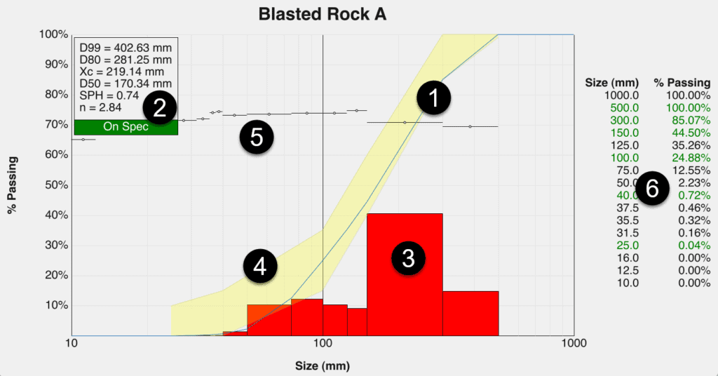
The chart can be configured to show the information most useful to the application.
Start with the question
Before interpreting individual numbers, ask: What decision am I trying to make from this result?
For example:
- Is the material coarser or finer than expected?
- What percentage of material is below a process limit?
- How much material is above an oversize threshold?
- Is the distribution becoming more or less uniform?
- Has the PSD changed from a previous sample?
- Does the result fall within an operating specification?
- Is particle shape changing?
- Are large particles concentrated in a particular area?
- Is a user-defined colour proportion changing?
Different WipFrag results describe different aspects of the material. There is rarely one value that tells the whole story.
| REMEMBER |
| Interpret the result against the application. A smaller, larger, narrower, or wider particle size distribution is NOT automatically better. The useful result is the one that meets the requirements of the process or study. |
Jump to:
1. Start With the WipFrag Chart
•
2. Read the Particle Size Distribution Curve
•
•
4. Understand the WipFrag Statistics
•
5. Read the Histogram and Size Classes
•
6. Use the Specification Envelope
•
7. Review Particle Size Visually
•
8. Interpret Particle Shape and Colour Results
•
9. Combine and Compare Results
•
10. Calibration, Fines and Measurement Limits
•
11. Turn WipFrag Results Into Decisions
•
12. Spatial Results for UAV Analysis
•
•
WipFrag Results Quick Reference
•
2. Read the Particle Size Distribution Curve
The particle size distribution (PSD) curve shows how particle size is distributed through the analyzed material.
The horizontal axis represents particle size, while the vertical axis represents cumulative percentage passing — the percentage of material smaller than a selected size.
For example, if the curve shows ~25% passing at 100 mm:
- approximately 25% of the analyzed material is smaller than 100 mm; and
- approximately 75% is larger than 100 mm.
The percentage larger than a selected size can also be described as cumulative percentage retained. Passing and retained are complementary: ~25% passing 100 mm = ~75% retained above 100 mm
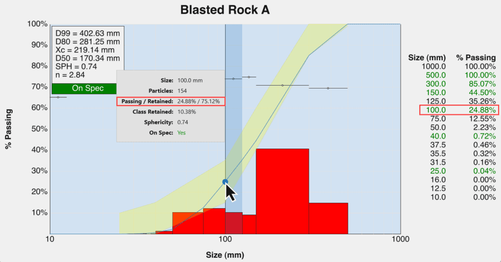
Do NOT confuse cumulative percent retained with the class retained value in the histogram. Cumulative retained includes everything larger than the selected size, while class retained describes only the material within one defined size interval.
Reading the curve from either direction
You can use the curve in two ways.
Start with a percentage
If you want to know the particle size corresponding to a particular percentile, read across from the percentage to the curve and then down to the size axis.
This is how values such as D50 and D80 are interpreted.
Start with a size
If you already have a meaningful size, such as a screen opening, crusher feed target, oversize limit, product specification, or laboratory sieve size, find that size on the horizontal axis and read upward to the curve.
The corresponding percentage tells you how much of the analyzed material falls below that size.
Understand the particle-size axis
Particle size distributions often cover a very wide range of sizes, so WipFrag plots the user-defined size classes with logarithmic scaling to make both smaller and larger particles visible on the same chart.
On a logarithmic size axis, equal distances across the chart do NOT represent equal numerical increases in particle size.
For example, the visual distance from 10 mm to 20 mm is NOT interpreted the same way as a linear ruler extending from 10 mm to 20 mm, and progressively larger size ranges can be displayed without compressing the smaller particles into one end of the graph.
Use the axis labels and measured values, rather than visual distance alone, when comparing particle sizes.
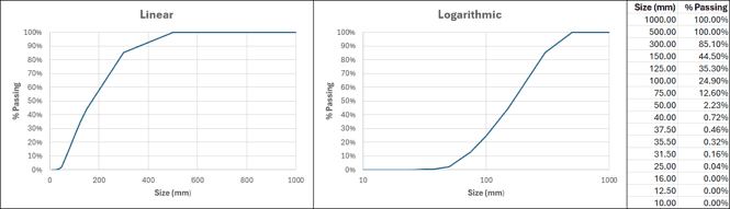
Compare the entire curve
D-values are useful summaries, but two distributions can have similar D50 or D80 values while differing elsewhere.
When comparing results, look at:
- the fine end;
- the middle of the distribution;
- the coarse end; and
- the overall shape of the curve.
Where two curves separate can be just as useful as the difference between individual statistics.
Jump to:
1. Start With the WipFrag Chart
•
2. Read the Particle Size Distribution Curve
•
•
4. Understand the WipFrag Statistics
•
5. Read the Histogram and Size Classes
•
6. Use the Specification Envelope
•
7. Review Particle Size Visually
•
8. Interpret Particle Shape and Colour Results
•
9. Combine and Compare Results
•
10. Calibration, Fines and Measurement Limits
•
11. Turn WipFrag Results Into Decisions
•
12. Spatial Results for UAV Analysis
•
•
WipFrag Results Quick Reference
•
3. Understand D-Values
WipFrag reports percentile sizes using the notation DXX. The number after D represents the percentage of material smaller than the reported size.
For example:
- D10: 10% of the material is smaller than this size.
- D50: 50% of the material is smaller and 50% is larger.
- D80: 80% of the material is smaller and 20% is larger.
- D95: 95% of the material is smaller and 5% is larger.
These values provide convenient reference points along the particle size distribution.
D50
D50 is the 50% passing size and represents the midpoint, or median, of the particle size distribution.
It is useful for:
- comparing the general size of different samples;
- tracking whether material is becoming coarser or finer; and
- summarizing the centre of the distribution.
D50 should NOT be interpreted as the arithmetic average particle size.
D80
D80 is the 80% passing size. It is commonly used in mining, aggregates, crushing, grinding, and fragmentation studies because it provides a useful measure toward the coarse side of the distribution without being controlled only by the very largest particles.
Use D80 to:
- compare fragmentation between samples;
- track changes over time;
- relate material size to downstream processing; and
- compare the result with a defined operational target.
Higher percentile sizes
Values such as D90 and D95 describe progressively more of the coarse end. These values can be useful where large particles or oversize are important, but they also depend strongly on whether the captured sample adequately represented the larger material.
A high-percentile value should therefore be interpreted together with the sampling method and the original imagery.
| IMPORTANT |
| A D-value describes the distribution. It does NOT explain what caused it. A change in D80, for example, tells you that the material size distribution changed. Determining why requires the relevant operating, geological, process, or blast information. |
Jump to:
1. Start With the WipFrag Chart
•
2. Read the Particle Size Distribution Curve
•
•
4. Understand the WipFrag Statistics
•
5. Read the Histogram and Size Classes
•
6. Use the Specification Envelope
•
7. Review Particle Size Visually
•
8. Interpret Particle Shape and Colour Results
•
9. Combine and Compare Results
•
10. Calibration, Fines and Measurement Limits
•
11. Turn WipFrag Results Into Decisions
•
12. Spatial Results for UAV Analysis
•
•
WipFrag Results Quick Reference
•
4. Understand the WipFrag Statistics
The WipFrag Data Box can display selected statistics alongside the PSD.
Not every statistic needs to be used for every application.
Particles
Particles is the number of particles measured in the analysis.
Use this value as context for the result rather than as a performance target by itself.
A larger particle count does NOT automatically mean a better analysis. The particles still need to be:
- visible;
- correctly delineated;
- properly scaled; and
- representative of the material being sampled.
Coverage
Coverage is the percentage of the image area included as analyzable material.
Coverage can help describe how much of the image contributed to the analysis.
It should be considered a supporting diagnostic rather than a particle-size result.
Sphericity
WipFrag’s Sphericity value describes particle shape based on the relationship between particle length and width.
Higher values represent particles that are more equant in the image, while lower values indicate more elongated particles.
Use sphericity to:
- compare particle shape between samples;
- identify changes in material shape;
- investigate handling or processing behaviour where particle shape matters; and
- complement the PSD when size alone does NOT fully describe the material.
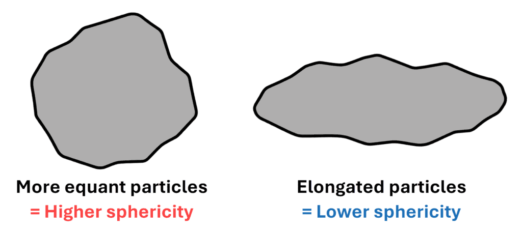
Sphericity describes the two-dimensional particle shape visible in the image. It should NOT be interpreted as a complete three-dimensional measurement of particle form.
Rosin-Rammler Statistics
WipFrag can describe the particle size distribution using the Rosin-Rammler model.
Xc – Characteristic Size
Xc is the Rosin-Rammler characteristic size.
In WipFrag: Xc = D63.2 before any calibration is applied.
This means 63.2% of the material is smaller than the Xc value.
Xc provides another useful reference size for comparing distributions.
n – Uniformity Coefficient
n describes the uniformity of the Rosin-Rammler distribution.
A higher n indicates a narrower, more uniform size distribution.
A lower n indicates a broader distribution containing a wider range of particle sizes.
Use n when the spread of the distribution matters, rather than looking only at whether the overall material is coarse or fine.
In WipFrag: n = uniformity coefficient before any calibration is applied.
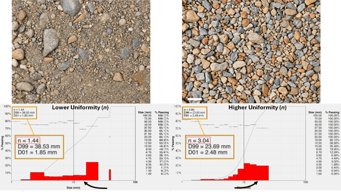
| EXAMPLE |
| Two samples may have similar D50 values but very different n values. One may contain particles concentrated around the median size, while the other contains a much wider mixture of fine and coarse material. |
Swebrec Statistics
WipFrag can also describe the distribution using the Swebrec model.
X50
X50 is the Swebrec 50% passing size.
In WipFrag: X50 = D50 before any calibration is applied.
Xmax
Xmax represents the maximum particle size used by the Swebrec distribution and corresponds to the largest particle measured in the analysis.
Interpret Xmax carefully when rare oversize particles are important. The result can only represent large particles that were included and correctly measured in the sampled imagery.
In WipFrag: Xmax = largest particle size before any calibration is applied.
b
b is the Swebrec curve-undulation parameter.
It helps describe the shape of the fitted Swebrec distribution.
Unlike a D-value, b is usually most useful as part of the fitted distribution or when comparing consistently generated results, rather than as a standalone operating target.
In WipFrag: b = curve-undulation parameter before any calibration is applied.
Jump to:
1. Start With the WipFrag Chart
•
2. Read the Particle Size Distribution Curve
•
•
4. Understand the WipFrag Statistics
•
5. Read the Histogram and Size Classes
•
6. Use the Specification Envelope
•
7. Review Particle Size Visually
•
8. Interpret Particle Shape and Colour Results
•
9. Combine and Compare Results
•
10. Calibration, Fines and Measurement Limits
•
11. Turn WipFrag Results Into Decisions
•
12. Spatial Results for UAV Analysis
•
•
WipFrag Results Quick Reference
•
5. Read the Histogram and Size Classes
While the PSD curve shows the cumulative distribution, the histogram divides the material into individual size classes to provide a different view of the material.
WipFrag supports up to 25 size classes which can be configured around the sizes that matter to the application.
Review individual size classes
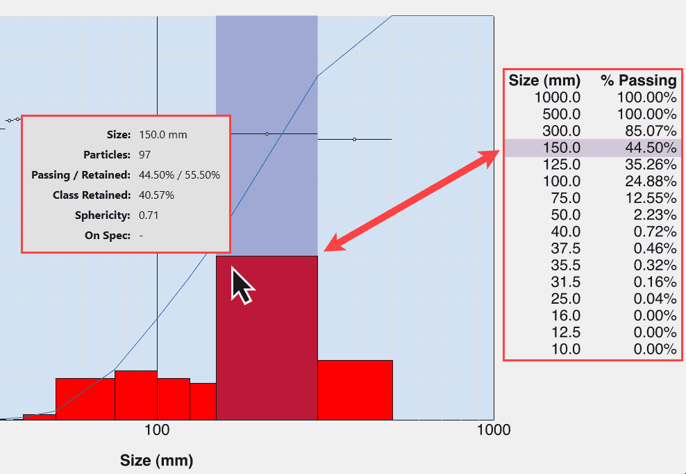
For a selected size class in the histogram, WipFrag can provide information including:
- Particles— the number of measured particles within that size class;
- Passing — the cumulative percentage of analyzed material smaller than the selected size;
- Retained — the cumulative percentage of analyzed material larger than the selected size;
- Class Retained — the percentage of material contained within that individual size class;
- Sphericity — the average sphericity of particles in that size class; and
- On Spec — whether that size class is on spec (when a specification envelope has been defined).
Look at the shape of the histogram
Do NOT look only at the tallest bar.
Consider:
- Where the material is concentrated: which size classes contain the largest retained proportion.
- Distribution width: a narrow grouping indicates material concentrated within a smaller size range, while a broad histogram indicates a wider mixture of sizes.
- Fine and coarse tails: material extending toward either end of the histogram can be important even when it does NOT dominate the distribution.
The desired histogram shape depends on the application. A broad distribution is NOT automatically poor, and a narrow distribution is NOT automatically better.
Choose meaningful size classes
Whenever practical, define size classes around real operating limits such as:
- screen openings;
- crusher or process thresholds;
- product specifications;
- oversize limits;
- laboratory sieve sizes; or
- other meaningful control points.
Whenever possible, the size classes should represent real decision points rather than arbitrary intervals.
Jump to:
1. Start With the WipFrag Chart
•
2. Read the Particle Size Distribution Curve
•
•
4. Understand the WipFrag Statistics
•
5. Read the Histogram and Size Classes
•
6. Use the Specification Envelope
•
7. Review Particle Size Visually
•
8. Interpret Particle Shape and Colour Results
•
9. Combine and Compare Results
•
10. Calibration, Fines and Measurement Limits
•
11. Turn WipFrag Results Into Decisions
•
12. Spatial Results for UAV Analysis
•
•
WipFrag Results Quick Reference
•
6. Use the Specification Envelope
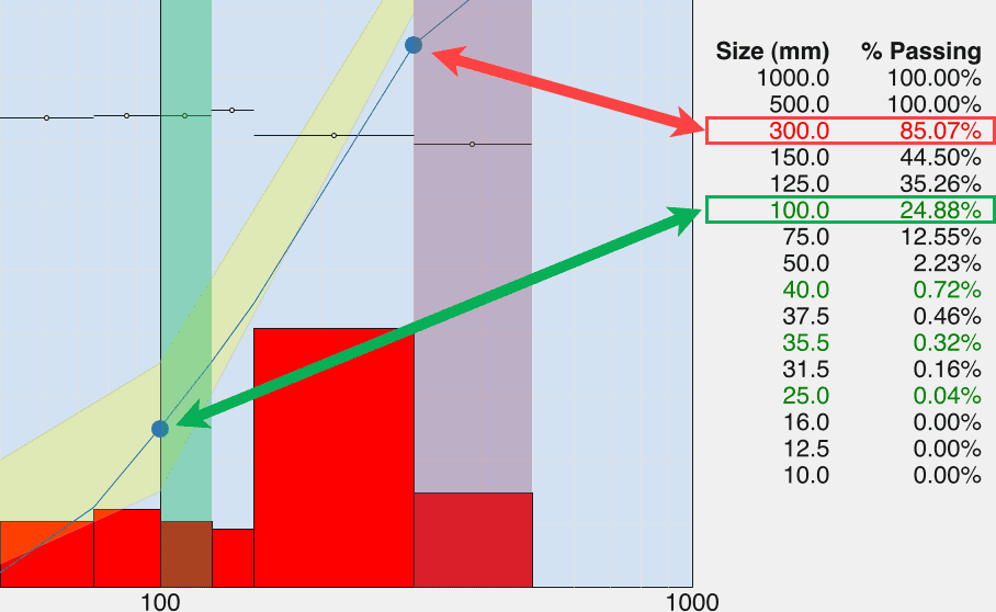
The Specification Envelope allows a target range to be placed directly on the WipFrag PSD chart.
For selected size classes, define:
- a minimum acceptable percentage passing; and
- a maximum acceptable percentage passing.
WipFrag displays the resulting target as a yellow envelope and identifies whether the result falls within the defined specification.
Why use an envelope?
A specification envelope moves interpretation beyond: “Is this material finer or coarser?”
and toward: “Does this distribution meet the required operating range?”
Use it when the application has known limits for:
- product sizing;
- crusher feed;
- screening;
- blast fragmentation;
- process control; or
- quality assurance.
Interpret the entire envelope
A result may meet the target through one part of the distribution and fall outside it elsewhere.
Look at where the curve leaves the envelope.
That indicates whether the difference is concentrated toward:
- the finer material;
- the middle of the distribution; or
- the coarse material.
| REMEMBER |
| The specification envelope is user-defined. WipFrag tells you whether the result meets the limits you entered; it does NOT determine what the correct operational limits should be. |
Jump to:
1. Start With the WipFrag Chart
•
2. Read the Particle Size Distribution Curve
•
•
4. Understand the WipFrag Statistics
•
5. Read the Histogram and Size Classes
•
6. Use the Specification Envelope
•
7. Review Particle Size Visually
•
8. Interpret Particle Shape and Colour Results
•
9. Combine and Compare Results
•
10. Calibration, Fines and Measurement Limits
•
11. Turn WipFrag Results Into Decisions
•
12. Spatial Results for UAV Analysis
•
•
WipFrag Results Quick Reference
•
7. Review Particle Size Visually
The PSD curve and histogram summarize the measured particle size distribution, but WipFrag also provides tools for visually relating those results back to the analyzed image.
Edit Assist
WipFrag’s Edit Assist can highlight:
- Largest by Count: a selected number of the largest measured particles.
- Largest by Size: all measured particles larger than a user-defined size.
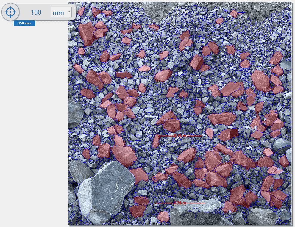
Use Edit Assist to:
- locate individual oversized particles or particles above a defined size;
- distinguish isolated oversize from a generally coarse distribution;
- identify where the largest measured particles occur in the source image; and
- review whether those particles have been delineated correctly.
Block Colours
WipFrag can also colour the delineated particles according to their measured size. Larger particles are shown with progressively hotter colours (redder), while smaller particles appear cooler (bluer).
Block Colours can help you:
- see how coarse and fine material is distributed through the image;
- identify areas containing relatively larger particles;
- spot areas worth reviewing more closely;
- relate the PSD and histogram back to the source image; and
- visually check whether the measured size pattern makes sense.
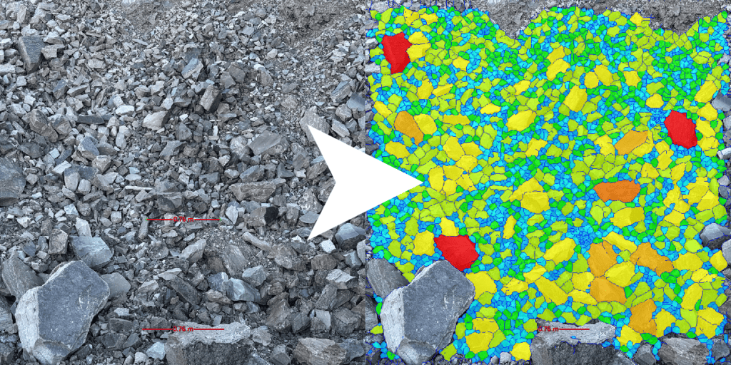
Particles that are NOT fully contained within the image and user-defined Area of Interest will NOT be included in the analysis.
The Block Colours feature can help you quickly establish which particles have been included.
Block Colours are also a visual interpretation aid. They do NOT replace the PSD curve, histogram, or numerical size results.
Jump to:
1. Start With the WipFrag Chart
•
2. Read the Particle Size Distribution Curve
•
•
4. Understand the WipFrag Statistics
•
5. Read the Histogram and Size Classes
•
6. Use the Specification Envelope
•
7. Review Particle Size Visually
•
8. Interpret Particle Shape and Colour Results
•
9. Combine and Compare Results
•
10. Calibration, Fines and Measurement Limits
•
11. Turn WipFrag Results Into Decisions
•
12. Spatial Results for UAV Analysis
•
•
WipFrag Results Quick Reference
•
8. Interpret Particle Shape and Colour Results
Sphericity through the distribution
In addition to the overall Sphericity statistic, WipFrag can display sphericity markers through the histogram.
These show how apparent particle shape changes across the measured size classes.
This can help answer questions such as:
- Are the larger particles more elongated than the smaller material?
- Is particle shape changing with size?
- Did a process change affect both size and shape?
Use the sphericity information together with the histogram and PSD rather than treating it as a separate quality score.
The desired shape depends on the application. Higher sphericity is NOT automatically better.
Colour ID
When Colour ID has been configured during the analysis, WipFrag can report the percentage of material matching the user-defined colour profile.
Up to two Colour IDs can be defined.
Use Colour ID when colour itself is a useful visual discriminator within the application.
Examples may include:
- visually distinct material types;
- contamination;
- dilution;
- product colour differences; or
- other user-defined colour classes.
Colour ID is a colour-match measurement. It should NOT be interpreted as chemical, mineralogical, or object identification unless the colour relationship has been established separately for the application.
Jump to:
1. Start With the WipFrag Chart
•
2. Read the Particle Size Distribution Curve
•
•
4. Understand the WipFrag Statistics
•
5. Read the Histogram and Size Classes
•
6. Use the Specification Envelope
•
7. Review Particle Size Visually
•
8. Interpret Particle Shape and Colour Results
•
9. Combine and Compare Results
•
10. Calibration, Fines and Measurement Limits
•
11. Turn WipFrag Results Into Decisions
•
12. Spatial Results for UAV Analysis
•
•
WipFrag Results Quick Reference
•
9. Combine and Compare Results
One image often represents only part of a larger sample. Where several images have been captured as representative samples of the same material population, WipFrag can combine analyses into a merged result.
When to merge
Merge results when several analyses were intentionally collected to represent:
- one blast;
- one pile;
- one stockpile;
- one laboratory sample;
- one production period; or
- another defined sample population.
The merged result provides a broader PSD than relying on one individual image.
When NOT to merge
Do NOT merge samples simply because they are available. Keep analyses separate when the purpose is to compare:
- different blasts;
- different operating conditions;
- different material types;
- different process stages;
- different geological areas; or
- different time periods.
Otherwise, the differences you are trying to observe may disappear into the combined distribution.
Compare like with like
When tracking changes, keep the sampling and analysis method as consistent as practical. Differences in the following variables can influence the result independently of a true change in the material:
- viewing distance;
- sample location;
- image resolution;
- scaling;
- lighting;
- analysis method; or
- particle-size visibility.
Use the Image Capture and Sampling Guide to help design a repeatable sampling program.
Choose what you need to track
Avoid collecting numbers simply because they are available. Before establishing a baseline or beginning a comparison study, decide which WipFrag results truly matter to the decision. Useful measurements may include:
- D50 or D80;
- another application-specific D-value;
- percentage passing a defined size;
- percentage above an oversize threshold;
- material within a selected size range;
- uniformity coefficient;
- sphericity;
- Colour ID;
- specification status; or
- another defined site or process KPI.
Choose measurements that relate directly to the process, product, study, or operating objective, then use those measurements consistently throughout the comparison.
Build a baseline
Once the measurements that matter have been selected, establish their normal range before using them to judge process changes.
A single comparison can show that two samples are different. A series of representative measurements collected under normal operating conditions provides much stronger context.
Where practical, establish a baseline from several representative analyses collected under normal operating conditions.
Then track the results that matter to the application, such as:
- D50;
- D80;
- percentage above or below a process threshold;
- uniformity coefficient;
- sphericity;
- specification status;
- Colour ID; or
- another site-specific KPI.
This makes it easier to distinguish normal variation from a meaningful process change.
| REMEMBER |
| A trend is usually more useful than an isolated number. |
Jump to:
1. Start With the WipFrag Chart
•
2. Read the Particle Size Distribution Curve
•
•
4. Understand the WipFrag Statistics
•
5. Read the Histogram and Size Classes
•
6. Use the Specification Envelope
•
7. Review Particle Size Visually
•
8. Interpret Particle Shape and Colour Results
•
9. Combine and Compare Results
•
10. Calibration, Fines and Measurement Limits
•
11. Turn WipFrag Results Into Decisions
•
12. Spatial Results for UAV Analysis
•
•
WipFrag Results Quick Reference
•
10. Calibration, Fines and Measurement Limits
A WipFrag result must always be interpreted within the limits of the imagery and sampling used to create it.
WipFrag can only measure what is represented
The chart does NOT create information that was absent from the sample.
If the imagery did NOT adequately represent:
- the largest particles;
- the smallest particles;
- a segregated portion of the sample; or
- another important part of the material,
the PSD may NOT fully represent the complete material population.
The fine end
Fine particles are especially dependent on image resolution and visibility.
If individual particles cannot be distinguished in the original image, they cannot be directly measured from that image.
For broad particle size distributions, use additional closer images where appropriate rather than expecting one wide image to resolve every relevant size.
The Zoom-Merge approach can combine analyses captured at different scales of observation to better represent broad distributions.
Zoom-Merge
Zoom-Merge combines analyses captured at different scales of observation. Wider images represent larger particles, while closer images improve the visibility of smaller particles that may be below the resolution of the wider view.
The results can then be merged to provide a more representative particle size distribution when the material contains a broad range of sizes.
Relative results versus calibrated results
WipFrag results can be valuable for comparative measurement even without calibration when the sampling and analysis method remains consistent.
For example, repeated analyses can show whether material is trending:
- coarser;
- finer;
- broader;
- narrower;
- more or less elongated; or
- toward or away from an operating target.
For many monitoring applications, the consistency of the measurement method is what makes the trend useful.
Calibration becomes important when the WipFrag result needs to correspond more closely with a physical sieve reference.
Calibration
WipFrag results can be calibrated using the Swebrec, Rosin-Rammler or xP-Fan models.
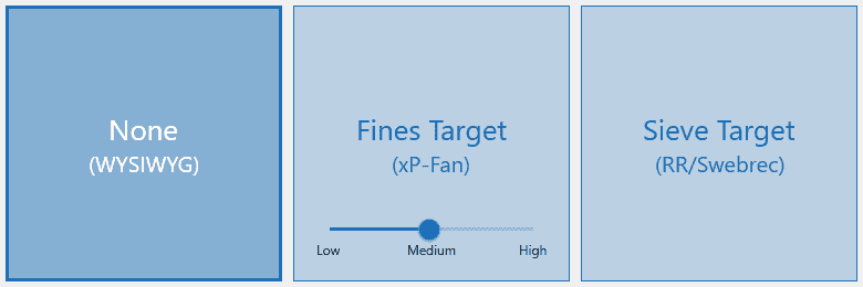
Fines Target
xP-Fan calibration is only for blast fragmentation results. It requires a user selection of high, medium, or low fines for the image sample being analyzed. The resulting xP-Fan equation will be displayed on the chart.
Sieve Target
Sieve calibration with Swebrec or Rosin-Rammler requires:
- real-world sieve results from the material; and
- WipFrag analysis of the same material that was sieved.
The sieve and image-analysis data can then be used to calculate a correction using the available calibration models.
Use calibration when
- long-term results need to correlate with a physical sieve reference;
- a repeatable production application has been established;
- representative sieve data are available; or
- the image-based result needs to be adjusted to an agreed physical reference method.
Do NOT use calibration to compensate for poor sampling
Calibration cannot correct an image that did NOT represent the material in the first place.
Good sampling and image capture still come first. You can read the Image Capture and Sampling Guide for a good starting point before the analysis process begins.
| IMPORTANT |
| Sampling determines what material is represented. Calibration adjusts how that measured distribution relates to a reference. They solve different problems. |
Jump to:
1. Start With the WipFrag Chart
•
2. Read the Particle Size Distribution Curve
•
•
4. Understand the WipFrag Statistics
•
5. Read the Histogram and Size Classes
•
6. Use the Specification Envelope
•
7. Review Particle Size Visually
•
8. Interpret Particle Shape and Colour Results
•
9. Combine and Compare Results
•
10. Calibration, Fines and Measurement Limits
•
11. Turn WipFrag Results Into Decisions
•
12. Spatial Results for UAV Analysis
•
•
WipFrag Results Quick Reference
•
11. Turn WipFrag Results Into Decisions
The purpose of WipFrag results is NOT simply to produce a PSD curve.
Use the output to answer a defined operational or technical question.
Is the material becoming coarser or finer?
Compare:
- D50;
- D80;
- other relevant D-values; and
- the overall PSD curve.
Do NOT rely on one percentile alone when the full distribution matters.
How much material is below a process threshold?
Use percentage passing at the relevant size.
For example, if a process limit is 75 mm, determine the percentage passing 75 mm directly from the curve or histogram. The remaining percentage is above that size.
How much oversize is present?
Define the oversize threshold as a relevant size class.
Use the percentage above that threshold rather than relying only on Xmax or the largest measured particle.
Xmax tells you about the largest particle measured; it does NOT tell you how much oversize material exists.
If the number and location of individual oversized particles matters, use Edit Assist in addition to the percentage result.
Is the distribution becoming more or less uniform?
Review:
- the shape of the PSD curve;
- the histogram; and
- the Rosin-Rammler n value.
Higher n indicates a narrower size distribution.
Is the result meeting the operating target?
Use the specification envelope.
This provides a direct comparison between the measured PSD and the defined minimum and maximum passing limits.
Has particle shape changed?
Compare sphericity under consistent sampling and analysis conditions.
Review both the average result and the sphericity through the size classes where appropriate.
Is colour-related material changing?
Where Colour ID has been deliberately configured for the application, compare the percentage matching the defined colour profiles.
Are coarse particles concentrated in one part of the sample?
Use:
- Block Colours;
- oversize highlighting;
- the original image; and
- spatial results where available.
This can help distinguish a generally coarse sample from a localized coarse zone.
What caused the result?
WipFrag measures the resulting material characteristics.
The PSD can show that material became:
- coarser;
- finer;
- broader;
- narrower;
- more elongated;
- less elongated; or
- different in colour.
It does NOT, by itself, establish the cause.
To determine why the result changed, compare WipFrag data with the appropriate context, such as:
- drill-and-blast records;
- geology;
- crusher settings;
- screen configuration;
- feed rate;
- process conditions;
- material source; or
- other operating data.
| REMEMBER |
| Measure first. Diagnose second. Use WipFrag to establish what changed, then use the relevant operating information to investigate why. |
Jump to:
1. Start With the WipFrag Chart
•
2. Read the Particle Size Distribution Curve
•
•
4. Understand the WipFrag Statistics
•
5. Read the Histogram and Size Classes
•
6. Use the Specification Envelope
•
7. Review Particle Size Visually
•
8. Interpret Particle Shape and Colour Results
•
9. Combine and Compare Results
•
10. Calibration, Fines and Measurement Limits
•
11. Turn WipFrag Results Into Decisions
•
12. Spatial Results for UAV Analysis
•
•
WipFrag Results Quick Reference
•
12. Spatial Results for UAV Analysis
For UAV analyses with location information, WipFrag can display results spatially using the GIS heatmap.
Depending on the selected result, the heatmap can show spatial changes in values such as:
- D80;
- D95;
- Xc;
- sphericity;
- uniformity; and
- Colour ID.
This can help identify where the material differs across a large sampled area rather than reducing the entire area to one merged value.
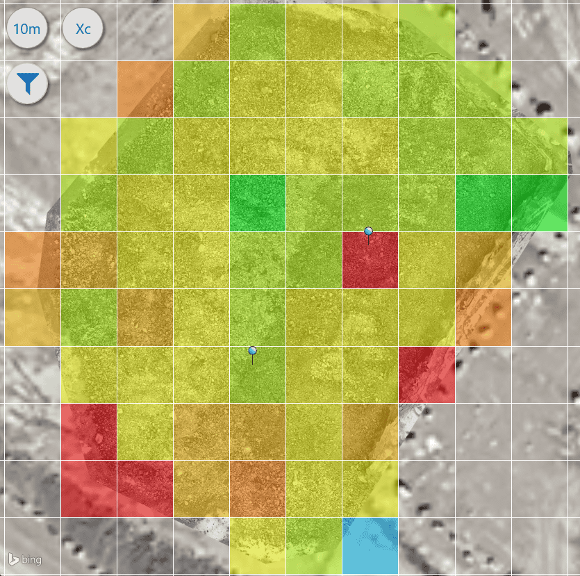
Interpret heatmaps relative to the target
Heatmap colours indicate relative differences in the selected result.
For particle-size outputs, hotter colours generally represent larger values, and cooler colours represent smaller values.
For other measurements, the colour relationship depends on the selected result.
Do NOT assume that a visually hot or cold area is automatically good or bad.
For example, larger particle size may be undesirable in one application and acceptable or expected in another.
Use the heatmap to identify where values differ, then interpret those differences against the operating target and sampling context.
Use spatial results to investigate variation
Spatial results can help identify:
- coarse or fine zones;
- changing uniformity across a blast;
- areas with different apparent particle shape;
- colour-related variation; or
- locations that should be reviewed against drill, blast, geological, or process information.
The heatmap helps locate the variation. It does NOT, by itself, explain the cause.
Jump to:
1. Start With the WipFrag Chart
•
2. Read the Particle Size Distribution Curve
•
•
4. Understand the WipFrag Statistics
•
5. Read the Histogram and Size Classes
•
6. Use the Specification Envelope
•
7. Review Particle Size Visually
•
8. Interpret Particle Shape and Colour Results
•
9. Combine and Compare Results
•
10. Calibration, Fines and Measurement Limits
•
11. Turn WipFrag Results Into Decisions
•
12. Spatial Results for UAV Analysis
•
•
WipFrag Results Quick Reference
•
13. Export and Record Results
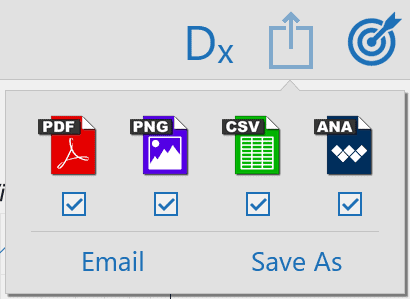
WipFrag results can be exported for reporting, analysis, and record keeping.
Available output formats include:
- PDF: formatted report or chart output.
- PNG: image output for presentations, reports, or documentation.
- CSV: numerical result data for use in spreadsheets, databases, or other analysis tools.
- ANA: the WipFrag analysis file, preserving the analysis for later use or sharing.
For projects containing merged analyses, individual ANA export is NOT available as a single project file.
Keep enough context with the result
When results will be compared later, retain information such as:
- sample or project name;
- date;
- location;
- material or source;
- operating condition;
- capture method;
- relevant process or blast settings; and
- any other information needed to understand what the result represents.
Use clear and consistent naming when results will become part of a longer-term monitoring program.
A PSD without its sampling and operating context can be difficult to interpret later.
Jump to:
1. Start With the WipFrag Chart
•
2. Read the Particle Size Distribution Curve
•
•
4. Understand the WipFrag Statistics
•
5. Read the Histogram and Size Classes
•
6. Use the Specification Envelope
•
7. Review Particle Size Visually
•
8. Interpret Particle Shape and Colour Results
•
9. Combine and Compare Results
•
10. Calibration, Fines and Measurement Limits
•
11. Turn WipFrag Results Into Decisions
•
12. Spatial Results for UAV Analysis
•
•
WipFrag Results Quick Reference
•
WipFrag Results Quick Reference
Start With the Curve
- What material or sample does this result represent?
- What decision am I trying to make?
- Is the PSD generally where I expected it to be?
- Is there a defined target, baseline, or previous result for comparison?
Check the Key Sizes
- D50: 50% passing size.
- D80: 80% passing size.
- Other D-values – Use the percentile that matters to the application.
- Xc: Rosin-Rammler characteristic size; equivalent to D63.2.
- X50: Swebrec 50% passing size; equivalent to D50.
- Xmax: Largest particle measured / Swebrec maximum size.
Check the Distribution
- n: Is the distribution becoming narrower or broader?
- Histogram: Which size ranges contain the material?
- Histogram width: Is the distribution concentrated or spread across a wide size range?
- Fine / coarse tails: Is significant material present at either end?
- Percentage Passing: How much is below the operational threshold?
- Percentage Retained: How much lies within the selected size ranges?
Check Oversize
- What size defines oversize for this application?
- What percentage is above that threshold?
- How many individual particles exceed the threshold?
- Are those particles isolated or widespread?
- Have the largest particles been delineated correctly?
Check Other Measurements
- Sphericity: Has apparent particle shape changed?
- Sphericity through the histogram: Does shape vary by particle size?
- Colour ID: Has the user-defined colour proportion changed?
- Coverage / Particles: Do the supporting analysis statistics make sense?
Check Against the Target
- Is a specification envelope available?
- Where does the curve meet or leave the target range?
- Is the difference at the fine, middle, or coarse end?
Check the Measurement
- Were the images representative?
- Were the important particle sizes visible?
- Should several analyses be merged?
- Is this a relative comparison or does it need calibration?
- Is suitable sieve data available if calibration is required?
- Does the result need to be compared with process, geological, or blast data?
Look for Trends
- Is there a baseline for normal operation?
- Is this result outside normal variation?
- Is the change persistent across several analyses?
- Were the samples collected using a comparable method?
Record the Result
- Export the required PDF, PNG, CSV, or ANA file.
- Keep the sample identity and operating context with the result.
- Use consistent naming for future comparison.
| WIPFRAG RESULTS – DO | WIPFRAG RESULTS – AVOID |
|---|---|
|
✓
Start with the operational or technical question.
✓
Read the full PSD curve, NOT only one statistic.
✓
Use D-values that are meaningful to the application.
✓
Use percentage passing at real process thresholds.
✓
Use the histogram to understand individual size ranges.
✓
Look at both the centre and tails of the distribution.
✓
Use n when distribution uniformity matters.
✓
Use the specification envelope when defined targets are available.
✓
Use Edit Assist when individual oversize particles matter.
✓
Use Block Colours to relate numerical sizes back to the image.
✓
Compare results collected using consistent sampling methods.
✓
Build a baseline before drawing conclusions from normal variation.
✓
Merge analyses that represent the same intended sample population.
✓
Keep sampling and operating context with exported results.
✓
Use calibration when suitable reference data are available.
✓
Review the original image whenever a result appears unusual.
|
✕
Treating smaller particle size as automatically better.
✕
Considering D50 as an arithmetic mean.
✕
Using one D-value to describe every aspect of the PSD.
✕
Using Xmax alone to describe oversize.
✕
Confusing particle count with percentage of material.
✕
Assuming a narrow distribution is always preferable.
✕
Treating sphericity as a universal quality score.
✕
Assuming a PSD explains why a process changed.
✕
Comparing results without considering how the samples were captured.
✕
Merging fundamentally different samples into one result.
✕
Over-interpreting particles near or below the image resolution.
✕
Using calibration to compensate for unrepresentative sampling.
✕
Treating Block Colours or GIS heatmaps as good/bad indicators without an application target.
✕
Treating Colour ID as chemical or material identification without application-specific validation.
|
| MORE INFORMATION |
| For image capture, sampling, and scaling guidance, refer to the Image Capture and Sampling Guide. For all software controls and configurations refer to the latest WipFrag User Manual. |
Jump to:
1. Start With the WipFrag Chart
•
2. Read the Particle Size Distribution Curve
•
•
4. Understand the WipFrag Statistics
•
5. Read the Histogram and Size Classes
•
6. Use the Specification Envelope
•
7. Review Particle Size Visually
•
8. Interpret Particle Shape and Colour Results
•
9. Combine and Compare Results
•
10. Calibration, Fines and Measurement Limits
•
11. Turn WipFrag Results Into Decisions
•
12. Spatial Results for UAV Analysis
•
•
 WipWare